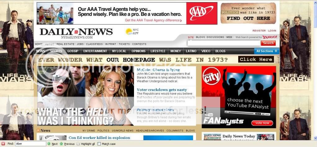
And by great, I mean “Holy hell, New York Daily News, why are you looking to MySpace and Photobucket for design tips!”
I really don’t think background ads, like this one for Life On Mars, are effective. Sure, it’s “noisy” and obvious, but it’s also absorbed into the overall design of the page, so rather than an eye-catching ad, it just looks like lousy design, leading to unconscious resentment by your users. Sort of like when the air pressure drops and you get a headache but can’t figure out why.
(h/t dan360man)

I think you are way off here. I would take a background ad any day over a painful overlay, pushdown, teardown etc…What i like about the background ad is that it complements the page and doesn’t ruin the site’s content or interface. Publishers need to make money.
anon: I agree that it could be far worse – those teardown ads are horrendous. But while it doesn’t ruin the interface or content, it also detracts from the content because of the noisiness of it. My eye doesn’t know where to go or what to look at.Yes, pubs need to make money. But too often they see the site as little more than a revenue/subscription-generator, rather than a medium that requires its own best practices.
Scott, I must disagree on this point. I love background ads. The creative is usually more thoughtful because it is a more expensive position to buy. My fave example of good background/wrapper/whatever folks like to call them is Pandora.
Liz: I like Pandora’s background ads, too. But that’s because they don’t overwhelm the actual content of the page.Your point about more thoughtful content is taken, but I don’t see anything thoughtful in the creative here. It looks like the kind of ad you’d see on a billboard, but without the clever tagline. I don’t get any idea about the show, or why it would appeal to me or to NY Daily News readers.